Gamification is the process of adding game elements in non-game contexts. The term was coined in the early 2000s and got to buzzword status a few years ago, as badges, trophies, points, and the other usual suspects started showing up all over the place—giving gamification, eventually, a bad name. Their implementation seemed artificial, and user engagement didn’t last long. But the match between game elements and non-game contexts is far from over. On the contrary.
"There is something all the products mentioned above have in common with each other, and with games in general: they all make their players feel victorious."
Take a look at popular consumer apps like Facebook, Instagram, Snapchat, TikTok, and Tinder. You rarely see one of gamification’s usual suspects in their design. Still, game design elements are integrated so deep in their products that it is hard to distinguish whether they are actually games, gamified systems, social apps, or something else altogether.
There is something all the products mentioned above have in common with each other, and with games in general: they all make their players feel victorious. This glorious feeling is one of the secrets of gamification done well.
In this article, I will walk you through a few gamification examples, and how you can use gamification to make your users feel like winners .
.
You might also like: What is Gamification? How to Encourage Engagement in Your Shopify App.
Introducing goal-oriented design
The first question that comes to mind when playing a game is “how do I win?”, as most games are goal-oriented systems. Therefore, one of the best practices for making a non-game system feel like a game is designing an end goal—a win condition—that is explicitly clear to the players.
Clear goals that are presented explicitly can motivate people to ‘win the game.’ For example, a win condition such as, “Sell 50 bottles of wine by Friday,” would work better than, “Sell as much as you can by Friday.”
A small tweak to the end goal—such as, “Whoever sells the most bottles of wine by Friday wins a vacation.”—would dramatically change the nature of this gamified system and would yield different behaviors.
When designing goals (and games in general), keep these four rules in mind, beautifully written by Mihaly Csikszentmihalyi in his book Flow:
In a goal-oriented model:
- Each moment of the activity must have a little goal
- The rules for attaining that goal must be clear
- The activity must give immediate feedback to provide certainty to the user at all times
- The tasks of the activity must be matched with operational skills, bestowing a sense of simultaneous control and challenge
Let’s see how this can be used in product design.
The profile mini-game
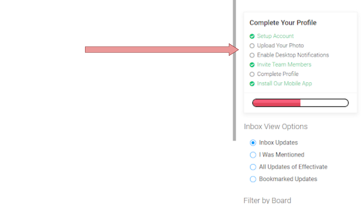
I took this screenshot from the project management tool Monday.com, but I bet you have seen this structure before. The reason it’s so ubiquitous is that it’s very effective. It follows Csikszentmihalyi’s recipe almost one by one.
- The big goal of completing the profile is broken into various activities with little goals.
- The rules for attaining the goals are clear, and they provide immediate feedback in the shape of a red progress bar that gradually turns green.
- The tasks of the activity are most certainly matched with the operational skills of the users.
- How about a challenge? Well, not so much. If this indeed were a game, it would be a rather boring one. But that’s okay. Completing the profile shouldn’t be challenging. It just needs to be done, and the goal-oriented model achieves good results in having users complete it.
- How about feeling victorious? Well, it’s sufficient. Completing a profile in this way is like ticking something off your to-do list. It feels good.
Despite its effectiveness, this structure of objectives is usually reserved for onboarding purposes only. When the profile is complete, users are left to their own devices with no goals to direct them. But it doesn’t have to be like this.
Uber badges for drivers
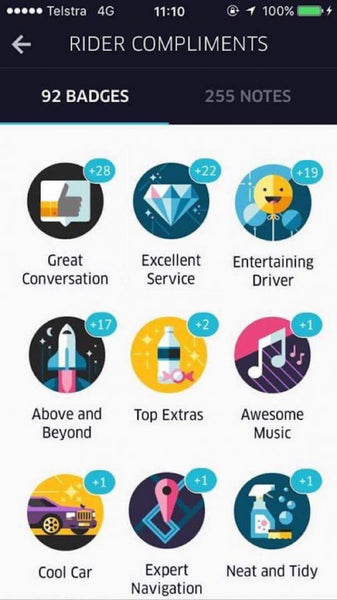
Uber has a mental model of how good drivers should act like. They should be tidy and polite. They should know their way around town, and, if possible, also be funny, pleasant, and have an up-to-date taste of music.
The thing is, Uber drivers aren’t really Uber employees and can’t be fired if they don’t meet the company’s gold standard. How can Uber communicate the image of the perfect driver to their drivers, without being arrogant? You got it. Badges.
This list of badges is actually very similar to the profile mini-game from the last section. The main difference is that it’s an ongoing list of goals, instead of a one-time thing.
Let’s analyze Uber’s badges according to our goal-oriented model:
- The big goal (being the perfect driver) is separated into mini-goals.
- The rules for attaining the goals are clear.
- There’s a clear success feedback in the form of badges, and unlike the profile mini-game, this one gives the player a better sense of control. A pinch of luck and a challenge are also thrown into the mix.
Winning a reward such as ‘Night Hero’ can really boost a driver’s morale and make them feel pretty good about themselves.
This is true goal-oriented, behavioral design.
Internalizing the goal-oriented model and looking at digital products from the perspective of helping users ‘win’ may also result in some out-of-the-box design ideas. One of my favorite examples of this is Tophatter.
Tophatter

Tophatter is an online ecommerce platform that makes their buyers feel like winners. All items on Tophatter are sold in a fast-paced auction style. Prices start at one dollar and quickly rise as players bid, a dollar at a time. A typical auction lasts around two to three minutes.
Let’s use our model again to analyze Tophatter.
- The goal is winning the item (a small and very important tweak! In most ecommerce platforms the goal is to buy an item. This is a significant change in behavior).
- The rules for attaining the goal are clear. The immediate feedback is evident. Auction participants know exactly where they stand in every second of the short auction.
- Participating in an auction is super easy—you just click the bid button. You don’t even need to register to start. However, the game is not that simple! It requires a fair amount of timing, luck, and even strategy to win the different auctions.
Winning an auction makes users feel wonderful. No wonder I bought all this useless junk I happened to ‘win’.
You might also like: Data-Rich: Use Holiday Data to Enhance Your Client's Conversion Strategy.
Use goal-oriented design to teach by example
One of the things that some games do amazingly well is to teach players how to play them. This is no easy task, as some games are actually pretty complicated, and there’s a very short grace period to learn them before users churn for good.
This is a big concern for non-game products as well. Educated users are better users, and onboarding them the best way possible is crucial. Still, often the only interaction a user has during a tutorial onboarding is hitting the skip button.
"Educated users are better users, and onboarding them the best way possible is crucial."
What can be skipped shall be skipped, and users will jump straight into the midst of the product without a basic knowledge of how to use its many features.
What can we learn from games about how to teach users?
- The tutorials are not skippable
- The tutorials are an integral part of the game
- They apply the goal-oriented model to teach player the ropes of playing the game
The product is the tutorial
Some games teach new players how to play even before the game starts.
The below game’s menu, for example, is actually the game’s first level. So when players figure out how to begin, they already know how to play the game.
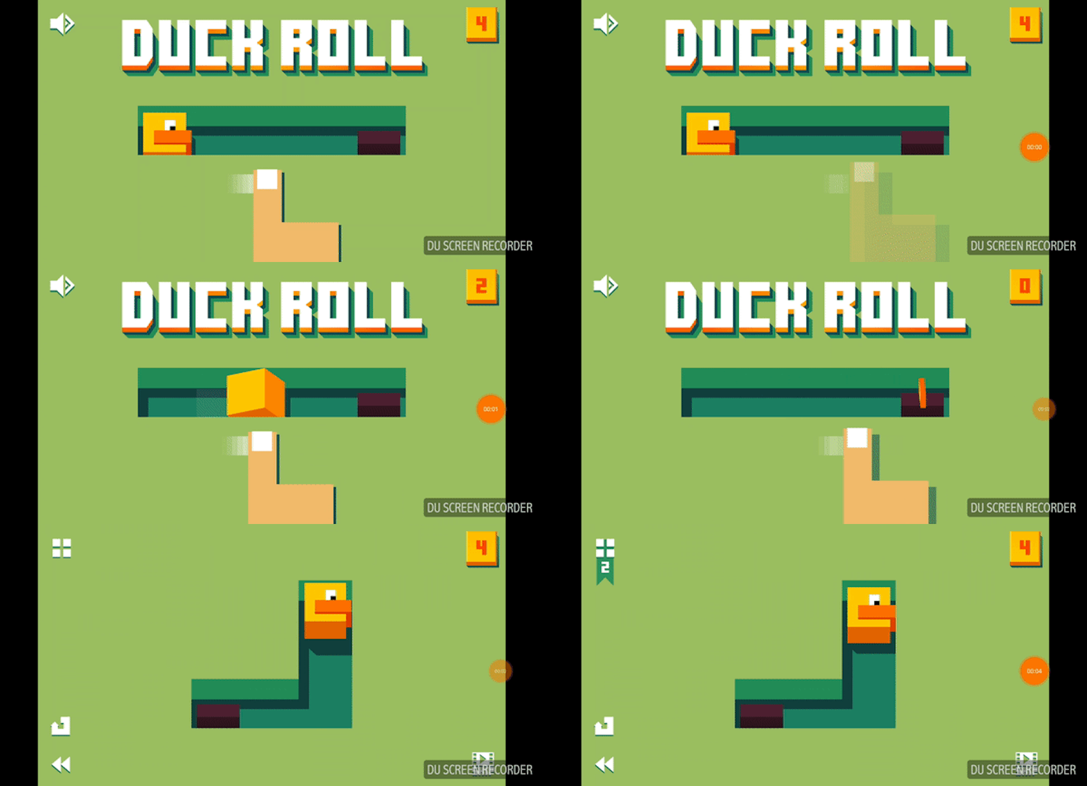
But not all games are as simple, or can be taught in the menu.
Take the game Clash Royale for example. It’s a card-collection player-vs-player battle game with a lot of depth and rules, and it’s not a simple game to teach.
The main goal is presented to the player as they first launch the game: win seven matches to unlock the multiplayer mode. Now, this goal is broken into mini-goals. Floating arrows show players how to drag cards and where to tap to deploy them. All the game’s basics are taught within the first few matches of the game, which are not skippable.
Slack
In the non-product world, the task of having players learn by doing is much harder. Often the onboarding process is developed last, and behaves differently than the rest of the product. It’s a major challenge.
One company that does a great job teaching by example has its roots deep in the world of gaming: Slack.
Slack engage its users with the product while teaching various features. They focus users on certain elements by darkening the screen and highlighting the relevant feature, then instruct them to act and experience the feature.
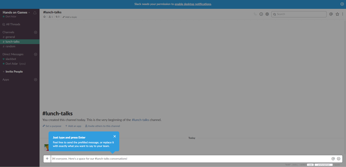
This approach is better than bestowing a bunch of non-interactive tooltips to the user with the hope that something will stick. However, this experience could be even better with a carrot in the shape of a reward at the end of the onboarding.
Tangible rewards
Sometimes a goal is not compelling enough. Sharing your email in exchange for yet another newsletter subscription is one example. These goals can be spiced up with tangible, money-equivalent rewards.
Tangible rewards are a strong motivator. They alter user behavior significantly. They work well for simple actions and for short time periods, and done right they can boost certain positive behaviors.
Woohoo
Woohoo is a plugin for ecommerce websites, aimed at helping shops increase their subscribers list. Users who are about to leave the website get a chance to win a tangible prize, in this case a discount, for playing a simple game.
This gamified solution works well, as participating in the game is a no-brainer (click a button), and the rules for winning are clear just by looking at the game. There’s an element of luck to it, and the prize is useful, and users feel like winners. Some of them will gladly leave their email behind.

This solution is integrated on top of the main product (the shop), so measuring its effectiveness is easy. If the solution gets old or isn’t delivering results as expected, it’s easy to remove it and try something else instead.
Hotjar
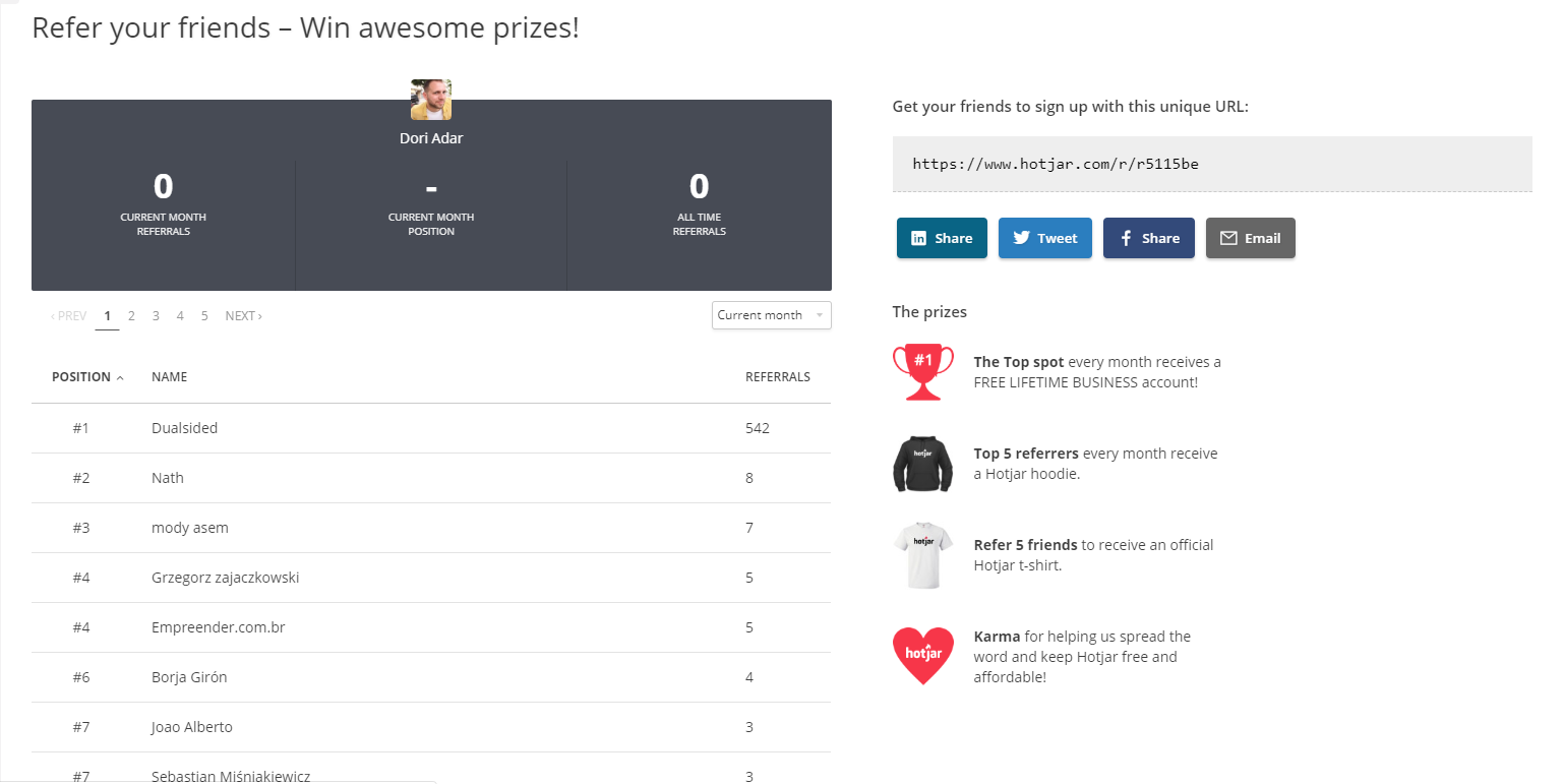
Hotjar is a web analytics tool that uses a reward system for its referral program. At the basic level, users who refer five valid friends receive the company’s official t-shirt.
Then things get more interesting. Referrers compete with each other and see their ranks reflected on the leaderboard. Every month, the top referrer gets a lifetime business account, and the five runner-ups compete for different prizes.
This referral game is integrated on top of the company’s real business. Theoretically, you don’t have to be a Hotjar user to play the game. And while the company needs to consider that there is a cost to handling frauds and detecting cheaters, the benefits of the game outweigh the downsides.
With this rewards scheme, Hotjar helps users who are enthusiastic about their product feel a sense of community (sometimes by winning company hoodies) and, of course, victory.
Think about your product
Can you offer your users tangible rewards to lead them towards a certain behavior? If you can, try to focus your efforts on a single thing you’d like your users to do, and build that feature on top of your product, not as an integral part of it.
Uncover the game hiding in your product
Through these gamification examples, I showed you a few ways of making your users feel good about themselves. Most products already have some kind of gamification, so sometimes all that’s needed are a few swipes with your design chisel to unravel the game that is already hiding in your product.
Make good use of the goal-oriented model, and always ask yourself: how you can make your users feel like winners. That’s the secret of effective gamification.
Read more
- What Are the Most Important Website Metrics You Should Track?
- 5 Ways to Overcome Choice Paralysis and Improve Conversion
- Indexable PWAs: Making Progressive Web Apps Perform for Users and Search Engines
- Landing Page Optimization: 10 Tips for Increasing Conversions
- How to Optimize Popups on Your Clients’ Stores

